Let’s say you’re trying to put some style into your app and you really want a nice background color to all of your PivotItem titles. How would you go about doing this? You’re probably thinking “Shawn, that’s easy, just modify the HeaderTemplate on the Pivot.” And I would probably agree with you. Let’s try that out.
<controls:Pivot Title="MY APPLICATION">
<controls:Pivot.HeaderTemplate>
<DataTemplate>
<Grid Background="Red">
<TextBlock Text="{Binding}"/>
</Grid>
</DataTemplate>
</controls:Pivot.HeaderTemplate>
<!--Pivot item one-->
<controls:PivotItem Header="item1"/>
<!--Pivot item two-->
<controls:PivotItem Header="item2"/>
</controls:Pivot>
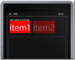
Looking at the design view of this gives

We did accomplish changing the background color, but this looks horrible. I wanted a nice banner going across the headers. So how can we accomplish this? My two default answers Expression Blend, and msdn. Unfortunately, I have yet to find Windows Phone styles on msdn. So looks like it’s Expression Blend to the rescue! Creating a copy of the default style you’ll see
<controlsPrimitives:PivotHeadersControl x:Name="HeadersListElement" Grid.Row="1"/>
So the headers are in a control made just for the headers of a PivotItem. Interesting, but not surprising. Creating a copy of the style of this control and you’ll see the template defined as:
<Setter Property="Template">
<Setter.Value>
<ControlTemplate TargetType="controlsPrimitives:PivotHeadersControl">
<Grid>
<Canvas x:Name="Canvas">
<ItemsPresenter/>
</Canvas>
</Grid>
</ControlTemplate>
</Setter.Value>
</Setter>
So we have a Grid and the background for the Grid is not set, not even using TemplateBinding. Luckily we can create a style for the PivotHeadersControl without needing to change any other styles. Add this style to the application resources (App.xaml) and it will apply to all pivots that are in your application.
<Style TargetType="controlsPrimitives:PivotHeadersControl">
<Setter Property="Template">
<Setter.Value>
<ControlTemplate TargetType="controlsPrimitives:PivotHeadersControl">
<Grid Background="Red">
<Canvas x:Name="Canvas">
<ItemsPresenter/>
</Canvas>
</Grid>
</ControlTemplate>
</Setter.Value>
</Setter>
</Style>
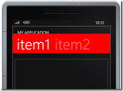
Now with this style, we get the following:

Perfect! Well, maybe not. We do have the nice banner, but it is really close to the title of the Pivot. Going back to the style of the Pivot itself shows that the template for the title is defined as:
<ContentPresenter ContentTemplate="{TemplateBinding TitleTemplate}"
Content="{TemplateBinding Title}"
Margin="24,17,0,-7"/>
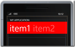
It has a –7 margin for the bottom. To get a gap between the title and the banner of the headers you can either change the margin of the ContentPresenter (if modifying the template of the Pivot), or you can specify a TitleTemplate.
<controls:Pivot.TitleTemplate>
<DataTemplate>
<TextBlock Text="{Binding}" Margin="0,0,0,7"/>
</DataTemplate>
</controls:Pivot.TitleTemplate>
And now we have
