Pivot was originally released as a demonstration project that was a separate download from Silverlight itself. At version 5, Pivot becomes part of the Silverlight family. Pivot allows users the ability to visualize their data. Puts the power of filtering and grouping their data without the need to learn complex SQL statements. The original version of Pivot required you to have an XML representation of the data, and images that it would display. This required extra work for the developer, or web administrator to create this data from their data store. With Silverlight 5, you now have the ability to bind to any property that your class has. It also allows you the ability to create what’s known as trading cards with XAML. These cards replace the images you previously needed. You can even define at what stage you want a trading card to display. By defining different trading cards at different levels, you can give the user more information the more they filter down their data.
When I first started looking into whether I’d be able to get PivotViewer results from ArcGIS Server, I figured I would have to create a Silverlight class with properties for all of the fields that I wanted to use within Pivot. It turns out that Pivot works great with the data you get straight from the ArcGIS or ArcFM Silverlight SDK. It easily binds to the Attributes Dictionary that is on the Graphics objects.
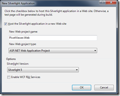
To get started using Pivot, you need to download the latest Silverlight 5 Tools. Create a new Silverlight Application. Make sure to pick Silverlight 5 as the version

You’ll need to add a reference to ESRI.ArcGIS.Client and System.Windows.Controls.Pivot. To add the ArcGIS Silverlight SDK, open the Add Reference dialog, and click the Browse tab. Browse to the location of ESRI.ArcGIS.Client assembly. The default location is C:\Program Files (x86)\ESRI SDKs\Silverlight.
Open MainPage.xaml.cs. We’re going to need to create a query to the ArcGIS Server. For my example, I’m going to use the Telvent ArcGIS Server at http://server.arcfmsolution.com/arcgis/rest/services. First, we need to query for the electrical switches that we’ll use within Pivot
public MainPage()
{
    InitializeComponent();

    QueryForSwitches();
}

private void QueryForSwitches()
{
    // Query for switches. Switches have LayerID of 3
    QueryTask task = new QueryTask("http://server.arcfmsolution.com/ArcGIS/rest/services/Electric/MapServer/3");
    Query query = new Query();

    // Return all of the fields, we want use them all, but good to have 'em anyways!
    query.OutFields.Add("*");

    // Get as many of the switches as we can
    query.Where = "ObjectID > 0";
    task.ExecuteCompleted += QueryTask_ExecuteCompleted;
    task.ExecuteAsync(query);
}
Add a call to this method within the constructor of the MainPage. When the task completes, all we need to do is set the DataContext to the Features that are returned.
void QueryTask_ExecuteCompleted(object sender, QueryEventArgs e)
{
    DataContext = e.FeatureSet.Features;
}
The XAML is where all of the magic happens. We are able to pick which fields the user will be able to filter/sort by, and define the trading cards. I want to give the user the ability to sort and filter switches by Installation Date, the Phase Designation, which Feeder it belongs to, and the Operating Voltage. So the fields I need from the Attributes dictionary are INSTALLATIONDATE, PHASEDESIGNATION, FEEDERID, and OPERATINGVOLTAGE. To do this, you add PivotViewerProperties.
<UserControl x:Class="PivotViewer.MainPage"
             xmlns="http://schemas.microsoft.com/winfx/2006/xaml/presentation"
             xmlns:x="http://schemas.microsoft.com/winfx/2006/xaml"
             xmlns:sdk="http://schemas.microsoft.com/winfx/2006/xaml/presentation/sdk"
             xmlns:ViewModels="clr-namespace:PivotViewer.ValueConverters">
    <Grid x:Name="LayoutRoot" Background="White">
        <Grid.Resources>
            <ViewModels:PhaseDesignationValueConverter x:Key="PhaseConverter"/>
            <ViewModels:VoltageToStringValueConverter x:Key="VoltageConverter"/>
        </Grid.Resources>
        <sdk:PivotViewer x:Name="MyPivot" ItemsSource="{Binding}">
            <!-- Setting PivotProperties -->
            <sdk:PivotViewer.PivotProperties>
                <sdk:PivotViewerDateTimeProperty Id="InstallDate" Options="CanFilter" DisplayName="Date Installed"
                    Binding="{Binding Attributes[INSTALLATIONDATE], StringFormat=\{0:MM/dd/yyyy\}}" />
                <sdk:PivotViewerStringProperty Id="Phase" Options="CanFilter" DisplayName="Phase"
                    Binding="{Binding Attributes[PHASEDESIGNATION], Converter={StaticResource PhaseConverter}}"  />
                <sdk:PivotViewerStringProperty Id="Feeder" Options="CanFilter" DisplayName="Feeder"
                    Binding="{Binding Attributes[FEEDERID]}"  />
                <sdk:PivotViewerStringProperty Id="OpVoltage" Options="CanFilter" DisplayName="Operating Voltage"
                    Binding="{Binding Attributes[OPERATINGVOLTAGE], Converter={StaticResource VoltageConverter}}"  />
            </sdk:PivotViewer.PivotProperties>
        </sdk:PivotViewer>
    </Grid>
</UserControl>
I’m using fields that have domain values, so I need a few value converters, I won’t bore you with the conversion of the domains here. If you need to sort/filter by date values, like the Installation Date, use a PivotViewerDateTimeProperty This gives you cool date filtering capabilities. I don’t have any integer values that I’m sorting by, but if I did I would use the PivotViewerNumericProperty. To create a trading card, add a PivotViewerItemTemplate to the ItemTemplates collection.
<sdk:PivotViewer.ItemTemplates>
    <sdk:PivotViewerItemTemplate>
        <Border Width="200" Height="200" Background="Gray" BorderBrush="Black" BorderThickness="1">
            <StackPanel Orientation="Vertical">
                <TextBlock Text="{Binding Attributes[FACILITYID]}" FontSize="24" Foreground="White" />
                <StackPanel Margin="10,0">
                    <TextBlock Text="Feeder" Foreground="White" FontSize="18" Margin="0,10,0,0"/>
                    <TextBlock Text="{Binding Attributes[FEEDERID]}" FontSize="14" Foreground="White" />

                    <TextBlock Text="Voltage" Foreground="White" FontSize="18" Margin="0,10,0,0"/>
                    <TextBlock Text="{Binding Attributes[OPERATINGVOLTAGE],
                               Converter={StaticResource VoltageConverter}}"
                               FontSize="14" Foreground="White" />

                    <TextBlock Text="Installed" Foreground="White" FontSize="18" Margin="0,10,0,0"/>
                    <TextBlock Text="{Binding Attributes[INSTALLATIONDATE], StringFormat=\{0:MM/dd/yyyy\}}"
                               FontSize="14" Foreground="White" />
                </StackPanel>
            </StackPanel>
        </Border>
    </sdk:PivotViewerItemTemplate>
</sdk:PivotViewer.ItemTemplates>
This gives our trading card a Metro feel. But there isn’t much data here, as the user drills further into their data, I want to show them more. We can add more trading cards if we want to add more detail when users start filtering their data, or using the zoom capability of Pivot. To do this you set the MaxWidth property of the PivotViewerItemTemplate, and add another template.
<sdk:PivotViewerItemTemplate MaxWidth="250">
To see more, download the complete sample here. Give your users the power to SEE their data.