As you have probably read, the Metro Windows Store projects in Visual Studio now comes preloaded with a ton of styles for your AppBar. I love this style of button. You get the nice icon and text to indicate what the icon is supposed to mean (sometimes the icon can be confusing). Having both the icon and the text removes the need for users to hover over an icon to see what it’s suppose to be.
As awesome as the style is for buttons on the AppBar, they do have some limitations. They are big, and the text is on the bottom. This design makes it hard to put this style of icon in other parts of your app. Take a look at the Games app. Go all the way to the left and you’ll see your avatar along with ways to do more with your Xbox account. You accomplish these actions with buttons that look a lot like the AppBar buttons.

Creating a style for these button is really easy. In the past you’ve needed Expression Blend to be really effective at editing or creating styles of controls. Now this can be done within Visual Studio. If you need to edit any of the VisualStates of the control it’s best to use Blend. Once again you’re in luck because Blend comes with Visual Studio 2012!
Open Visual Studio and create a new Windows Store project. On a xaml page, add a new Button and apply the AppBarButtonStyle style.
<Button Style="{StaticResource AppBarButtonStyle}"/>
If you like using the designer, drag a Button onto the page, right click and select Edit Template –> Apply Resource –> AppBarButtonStyle.

When looking at the button in the designer all you will see is a circle. Now right click the Button and select Edit Template –> Edit a Copy…

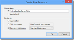
Name the style InlineAppBarButonStyle and place the style into the StandardStyles.xaml file.

I’m a XAML guy. I’ll rarely have the designer open. So from here on it’s pure XAML. All of this is still possible if you like using the designer. The AppBarButtonStyle limits the Width of the Button to 100. That Width will not allow for much text, so we’ll need to remove it. Find the Grid with the name “RootGrid” and remove the Width property. Removing the property will set the Width to be auto sized.
<Grid x:Name="RootGrid" Background="Transparent">
The first child of the Grid (collapse all of the VisualStates) is a StackPanel. By default the StackPanel stacks it’s children vertically. We want to change it stack Horizontally. Set the Orientation property to be Horizontal.
<StackPanel VerticalAlignment="Top" Margin="0,12,0,11" Orientation="Horizontal">
Let’s take a look at how our button currently is styled*

*I applied another style to get this image. I’ll go into that later.
Not quite what we want. The text is wrapping whereas the text in the Games app does not. The TextBlock has a width of 88 that we’ll want to delete that. While we’re making changes to the TextBlock set the VerticalAlignment to Center, remove the TextAlignment and change the FontSize.
<TextBlock x:Name="TextLabel"
Text="{TemplateBinding AutomationProperties.Name}"
Foreground="{StaticResource AppBarItemForegroundThemeBrush}"
FontSize="16"
VerticalAlignment="Center"
MaxHeight="32"
TextTrimming="WordEllipsis"
Style="{StaticResource BasicTextStyle}"/>
This gets us very close, but the icons are still very large. The first thing we need to do is change the FontSize of the button itself. The FontSize is used for the icon that is inside the circle. The text has it’s own FontSize. Change the FontSize from 20 to 14.
<Setter Property="FontSize" Value="14"/>
I won’t bore you with setting each of the properties to get the circle and background smaller, so here’s the rest of the StackPanel.
<StackPanel VerticalAlignment="Top" Margin="0,3" Orientation="Horizontal">
<Grid Width="40" Height="40" HorizontalAlignment="Center">
<TextBlock x:Name="BackgroundGlyph" Text="" FontFamily="Segoe UI Symbol" FontSize="41" Margin="2,-10,0,0" Foreground="{StaticResource AppBarItemBackgroundThemeBrush}"/>
<TextBlock x:Name="BackgroundCheckedGlyph" Visibility="Collapsed" Text="" FontFamily="Segoe UI Symbol" FontSize="41" Margin="2,-10,0,0" Foreground="{StaticResource AppBarItemForegroundThemeBrush}"/>
<TextBlock x:Name="OutlineGlyph" Text="" FontFamily="Segoe UI Symbol" FontSize="41" Margin="2,-10,0,0"/>
<ContentPresenter x:Name="Content" HorizontalAlignment="Center" Margin="-1,0,0,0" VerticalAlignment="Center"/>
</Grid>
<TextBlock x:Name="TextLabel"
Text="{TemplateBinding AutomationProperties.Name}"
Foreground="{StaticResource AppBarItemForegroundThemeBrush}"
Margin="3,0,2,0"
FontSize="16"
VerticalAlignment="Center"
MaxHeight="32"
TextTrimming="WordEllipsis"
Style="{StaticResource BasicTextStyle}"
FontFamily="Segoe UI Symbol"/>
</StackPanel>
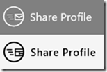
And here is how it looks when compared to the original. I couldn’t find the exact share image used within the Games app,.

Now you’re ready to create some inline “appbar” buttons. If you want to use the same button in many places then create a style for that type of button. Then set that style for your button.
<Style x:Key="EditInlineAppBarButtonStyle" TargetType="ButtonBase" BasedOn="{StaticResource InlineAppBarButtonStyle}">
<Setter Property="AutomationProperties.AutomationId" Value="InlineEditAppBarButton"/>
<Setter Property="AutomationProperties.Name" Value="Inline AppBar Button Style"/>
<Setter Property="Content" Value=""/>
</Style>
If you’re only going to use it once, then you can set the properties within the button itself.
<Button Style="{StaticResource InlineAppBarButtonStyle}"
AutomationProperties.Name="Inline AppBar Button Style"
Content=""/>
From here it’s up to you to change the color of the button along with the VisualStates to match the theme you need. As is, the style will work great with dark backgrounds.