Visually Located

XAML and GIS

Easily create light themed styles for your Win8 Settings pane

One of the things I love about Windows Store apps is their ability to integrate with the system. One of these integration points is the Settings Charm. I’m not going to show you how to create a settings flyout. There are already lots of examples out there that do this. There are even some helpers like the SettingsFlyout available in Callisto and the helper created by Jerry Nixon. Recently Tim Heuer made a change to the SettingsFlyout to set the background to white. This change allows your app to follow the guidelines. He also added a property that allows you to change what you want the background to be if you are not a fan of white.

This change to the background works great if your app has a light requested theme. If you are using the default dark theme then the new background on the flyout becomes a nightmare. It’s a nightmare because now you have to style all of the controls you use for your settings to work properly with a light theme. You could easily start changing the brushes of various properties, but this doesn’t look very polished. You could restyle the controls and start to guess and what colors to use for this or that, but you’ll forget something (at least I did, and it was a lot).

There has to be an easy way to get light themed styles, right? I couldn’t find one, but I did find a way to easily create them. The resources and styles used by controls within the app are generally not found within the app itself. The app requests a theme from the system and that theme has all of resources and styles This allows you to create custom controls and use those brushes and have the control be styled properly for both light and dark themed apps. Because these resources are not available to us, we’ll need to create our own.

This trick can be done using either Visual Studio or Blend. For this blog I’m going to show examples using Visual Studio. The first step is to create a new Windows Store project. It’s best just to use the Blank App project as you will not need any of the extra stuff installed with the other ones. Open the App.xaml file (not App.xaml.cs) and set the RequestedTheme to be Light

<Application x:Class="LightStyles.App"
             xmlns="http://schemas.microsoft.com/winfx/2006/xaml/presentation"
             xmlns:x="http://schemas.microsoft.com/winfx/2006/xaml"
             xmlns:local="using:LightStyles"
             RequestedTheme="Light">

Next, we want to add a new resource dictionary to store all of our styles. In the Solution Explorer window, right click the Common folder and select Add –> New Item…

image

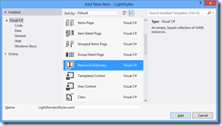
In the Add New Item dialog, select Resource Dictionary and name it LightStandardStyles.xaml
image

We then need to add this xaml to our App.xaml. Open the App.xaml and copy the line that adds the StandardStyles.xaml, paste it directly under that line and change the name to LightStandardStyles.

<ResourceDictionary Source="Common/StandardStyles.xaml"/>
<ResourceDictionary Source="Common/LightStandardStyles.xaml"/>

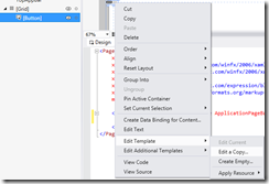
To start us off, I’ll create a light theme style for a Button. Open the MainPage.xaml file. and place a Button within the Grid. In the designer or the document outline window, right click the button and select Edit Template –> Edit a Copy…
image

Name the style LightThemeButtonStyle and place it in the current document. For some of the steps it will be easier to have the style in the age and then cut/paste the style into LightStandardStyles.xaml. Now for the tedious part. We need to create new brushes that will replace the existing brushes. This is really easy to do using Visual Studio or Blend. While viewing the xaml, scroll through and find a brush. The first one is going to be the background of the button itself.

Note: To make naming these styles easier, copy the name of the style. eg: ButtonBackgroundThemeBrush

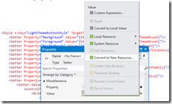
Open the Properties window and place your cursor on the line for the background. In the Properties windows, click on the green square next to the value of Value. In the popup, click on Convert to New Resource…
image

This allows you to create a local copy of the resource. Name the style LightButtonBackgroundThemeBrush and this time do place it in LightStandardStyles.xaml.

Note: The ButtonBackgroundThemeBrush is only used once, but it’s a good idea to do a find/replace of the name once you have created the new resource. When you do the replace, make sure that you match case and match whole word

Now you are on a rinse/repeat cycle. Follow the following steps for each of the brushes in the style. You can use these steps for every brush except for the brushes used in the states. Do not use these steps for brushes that use TemplateBinding, only the ones that use a StaticResource.

  1. Find brush
  2. Copy brush name
  3. In Properties window, click green square and select Convert to New Resource…
  4. Prefix ‘Light’ for the brush name (eg: ButtonBorderThemeThickness becomes LightButtonBorderThemeThickness)
  5. Place the resource into LightStandardStyles.xaml
  6. Replace (match case and whole word) any other uses of the resources with your new resource

During this process, you may encounter a message stating that changing the style will remove a visual state style. I never confirmed whether this actually did remove the state style, but to be safe I cut the style out of the template and pasted it into another file. Now we need to get the brushes changed for the different visual states. This is where having the style in the page will pay off. If you removed the states, now is the time to paste them back in. In your page add a Rectangle.

<Grid Background="{StaticResource ApplicationPageBackgroundThemeBrush}">
    <Button Style="{StaticResource LightThemeButtonStyle}"  />
    <Rectangle />
</Grid>

Now go to your visual states and find a state that changes a brush (eg: PointerOver changes the Background property of the border to ButtonPointerOverBackgroundThemeBrush). Copy the resource and place that as the Fill for the new Rectangle.

<Rectangle Fill="{StaticResource ButtonPointerOverBackgroundThemeBrush}" />

Now that you have the brush being used, you can follow the follow the six steps above to change all other resources in the file. Rinse/repeat this cycle until all of the brush resources have been updated. Now you can cut the resource out of the page and paste it into LightStandardStyles.xaml. This does sound tedious, but you can create a light style pretty quickly. But today, and today only, you can download the light styles that I created. This resource file has light themed styles for the ToggleSwitch, TextBox, ComboBox, Button (including a LightAppBarButtonStyle) and all of the standard TextBlock styles.

Creating an inline AppBar Button Style for your Win8 apps

As you have probably read, the Metro Windows Store projects in Visual Studio now comes preloaded with a ton of styles for your AppBar. I love this style of button. You get the nice icon and text to indicate what the icon is supposed to mean (sometimes the icon can be confusing). Having both the icon and the text removes the need for users to hover over an icon to see what it’s suppose to be.

As awesome as the style is for buttons on the AppBar, they do have some limitations. They are big, and the text is on the bottom. This design makes it hard to put this style of icon in other parts of your app. Take a look at the Games app. Go all the way to the left and you’ll see your avatar along with ways to do more with your Xbox account. You accomplish these actions with buttons that look a lot like the AppBar buttons.

image

Creating a style for these button is really easy. In the past you’ve needed Expression Blend to be really effective at editing or creating styles of controls. Now this can be done within Visual Studio. If you need to edit any of the VisualStates of the control it’s best to use Blend. Once again you’re in luck because Blend comes with Visual Studio 2012! 

Open Visual Studio and create a new Windows Store project. On a xaml page, add a new Button and apply the AppBarButtonStyle style.

<Button Style="{StaticResource AppBarButtonStyle}"/>

If you like using the designer, drag a Button onto the page, right click and select Edit Template –> Apply Resource –> AppBarButtonStyle.

image

When looking at the button in the designer all you will see is a circle. Now right click the Button and select Edit Template –> Edit a Copy…

image

Name the style InlineAppBarButonStyle and place the style into the StandardStyles.xaml file.

image

I’m a XAML guy. I’ll rarely have the designer open. So from here on it’s pure XAML. All of this is still possible if you like using the designer. The AppBarButtonStyle limits the Width of the Button to 100. That Width will not allow for much text, so we’ll need to remove it. Find the Grid with the name “RootGrid” and remove the Width property. Removing the property will set the Width to be auto sized.

<Grid x:Name="RootGrid" Background="Transparent">

The first child of the Grid (collapse all of the VisualStates) is a StackPanel. By default the StackPanel stacks it’s children vertically. We want to change it stack Horizontally. Set the Orientation property to be Horizontal.

<StackPanel VerticalAlignment="Top" Margin="0,12,0,11" Orientation="Horizontal">

Let’s take a look at how our button currently is styled*

image
*I applied another style  to get this image. I’ll go into that later.

Not quite what we want. The text is wrapping whereas the text in the Games app does not. The TextBlock has a  width of 88 that we’ll want to delete that. While we’re making changes to the TextBlock set the VerticalAlignment to Center, remove the TextAlignment and change the FontSize.

<TextBlock x:Name="TextLabel"
           Text="{TemplateBinding AutomationProperties.Name}"
           Foreground="{StaticResource AppBarItemForegroundThemeBrush}"
           FontSize="16"
           VerticalAlignment="Center"
           MaxHeight="32"
           TextTrimming="WordEllipsis"
           Style="{StaticResource BasicTextStyle}"/>

This gets us very close, but the icons are still very large. The first thing we need to do is change the FontSize of the button itself. The FontSize is used for the icon that is inside the circle. The text has it’s own FontSize. Change the FontSize from 20 to 14.

<Setter Property="FontSize" Value="14"/>

I won’t bore you with setting each of the properties to get the circle and background smaller, so here’s the rest of the StackPanel.

<StackPanel VerticalAlignment="Top" Margin="0,3" Orientation="Horizontal">
    <Grid Width="40" Height="40" HorizontalAlignment="Center">
        <TextBlock x:Name="BackgroundGlyph" Text="&#xE0A8;" FontFamily="Segoe UI Symbol" FontSize="41" Margin="2,-10,0,0" Foreground="{StaticResource AppBarItemBackgroundThemeBrush}"/>
        <TextBlock x:Name="BackgroundCheckedGlyph" Visibility="Collapsed" Text="&#xE0A8;" FontFamily="Segoe UI Symbol" FontSize="41" Margin="2,-10,0,0" Foreground="{StaticResource AppBarItemForegroundThemeBrush}"/>
        <TextBlock x:Name="OutlineGlyph" Text="&#xE0A7;" FontFamily="Segoe UI Symbol" FontSize="41" Margin="2,-10,0,0"/>
        <ContentPresenter x:Name="Content" HorizontalAlignment="Center" Margin="-1,0,0,0" VerticalAlignment="Center"/>
    </Grid>
    <TextBlock x:Name="TextLabel"
               Text="{TemplateBinding AutomationProperties.Name}"
               Foreground="{StaticResource AppBarItemForegroundThemeBrush}"
               Margin="3,0,2,0"
               FontSize="16"
               VerticalAlignment="Center"
               MaxHeight="32"
               TextTrimming="WordEllipsis"
               Style="{StaticResource BasicTextStyle}" 
               FontFamily="Segoe UI Symbol"/>
</StackPanel>

And here is how it looks when compared to the original. I couldn’t find the exact share image used within the Games app,.

image

Now you’re ready to create some inline “appbar” buttons. If you want to use the same button in many places then create a style for that type of button. Then set that style for your button.

<Style x:Key="EditInlineAppBarButtonStyle" TargetType="ButtonBase" BasedOn="{StaticResource InlineAppBarButtonStyle}">
    <Setter Property="AutomationProperties.AutomationId" Value="InlineEditAppBarButton"/>
    <Setter Property="AutomationProperties.Name" Value="Inline AppBar Button Style"/>
    <Setter Property="Content" Value="&#xE104;"/>
</Style>

If you’re only going to use it once, then you can set the properties within the button itself.

<Button Style="{StaticResource InlineAppBarButtonStyle}"
        AutomationProperties.Name="Inline AppBar Button Style"
        Content="&#xE104;"/>

From here it’s up to you to change the color of the button  along with the VisualStates to match the theme you need. As is, the style will work great with dark backgrounds.

Fixing the VisualState of your Win8 AppBar ToggleButton

This post would also be called Fixing the AppBarButtonStyle for ToggleButton support in you Win8 app: Part 2

In my last post I explained how to fix the AppBarButtonStyle to support ToggleButtons. This minor fix does give you the correct style, however there are more problems. I’m not sure if it is a problem with the style, or with the ToggleButton, but after checking and unchecking the button, the state becomes completely messed up.

image

When the ToggleButton does not have an AppBarButtonStyle set, it works great. We only get this problem when we apply one of those styles. With that said, it would seem there is a problem with the style, but the style looks just fine. I’ve seen some solutions that change the Unchecked and/or Normal VisualState back to the original style. I have not seen this working and this should happen by default. It appeared to me that the VisualState was actually getting messed up. I tried subscribing to the Click event and changing the VisualState manually.

void AppBarToggleButton_Click(object sender, RoutedEventArgs e)
{
    ToggleButton button = (ToggleButton)sender;
    VisualStateManager.GoToState(button, button.IsChecked.Value ? "Checked" : "Unchecked", false);
}

I was happy surprised to find that this worked great. Of course you do not want to subscribe to this event for every ToggleButton that you have. So I created a ToggleButton that would fix this (until MS fixes it).

public class AppBarToggleButton : ToggleButton
{
    public AppBarToggleButton()
    {
        this.Click += AppBarToggleButton_Click;
    }
 
    void AppBarToggleButton_Click(object sender, RoutedEventArgs e)
    {
        VisualStateManager.GoToState(this, IsChecked.Value ? "Checked" : "Unchecked", false);
    }
}

<sidenote>ToggleButton has a virtual OnToggle method that you would think would work great, however this method is called before the click event and before IsChecked changes.</sidenote>

Fixing the AppBarButtonStyle for ToggleButton support in your Win8 apps

With the RTM release of Visual Studio 2012 the Visual Studio team made some improvements to the various AppBar button styles. One of these awesome improvements was to add support for ToggleButtons. Now you can use any of these out-of-the-box styles with Buttons AND ToggleButtons. This is pretty awesome… Except for the fact that the style is missing a required TextBlock. This TextBlock toggles the color of the button. Without it you do not get a visual indication that the ToggleButton is checked. Even worse, is that the application crashes when the ToggleButton is checked.

To fix this, open the StandardStyles.xaml file and go to the AppBarButtonStyle. Insert the following line directly under the “BackgroundGlyph” TextBlock

<TextBlock x:Name="BackgroundCheckedGlyph" Visibility="Collapsed" Text="&#xE0A8;" FontFamily="Segoe UI Symbol" FontSize="53.333" Margin="-4,-19,0,0" Foreground="{StaticResource AppBarItemForegroundThemeBrush}"/>

After inserting that line, the Grid within the StackPanel should look like:

<Grid Width="40" Height="40" Margin="0,0,0,5" HorizontalAlignment="Center">
    <TextBlock x:Name="BackgroundGlyph" Text="&#xE0A8;" FontFamily="Segoe UI Symbol" FontSize="53.333" Margin="-4,-19,0,0" Foreground="{StaticResource AppBarItemBackgroundThemeBrush}"/>
    <TextBlock x:Name="BackgroundCheckedGlyph" Visibility="Collapsed" Text="&#xE0A8;" FontFamily="Segoe UI Symbol" FontSize="53.333" Margin="-4,-19,0,0" Foreground="{StaticResource AppBarItemForegroundThemeBrush}"/>
    <TextBlock x:Name="OutlineGlyph" Text="&#xE0A7;" FontFamily="Segoe UI Symbol" FontSize="53.333" Margin="-4,-19,0,0"/>
    <ContentPresenter x:Name="Content" HorizontalAlignment="Center" Margin="-1,-1,0,0" VerticalAlignment="Center"/>
</Grid>

Now your app will not crash with that ToggleButton!

Next, read Part 2 to fix the VisualState of the ToggleButton.

Adding multiple lines of text to your Win8 tile update

Live tiles is one of the best things about Windows Phone and WinRT. I love how easy it is to add updates to your tiles in Windows Phone but hate how limited the updates are allowed to be. With WinRT comes a new API and more robust tile updates. There are many different types of tile updates and your app should support AT LEAST one square and one wide tile. If you’re like me (and I know I am), I started with the C# WinRT sample for App tiles and badges. I began looking at the code and could easily see that you use the TileUpdateManager to update your tile. The TileUpdateManager needs a TileNotification in order to update your tile. Here is where I quickly became lost in this rather complex sample. The TileNotification needs to be created with XML (an XmlDocumentto be exact) but I had not idea what XML elements are needed (Seriously, is all of the abstraction really needed here? This is suppose to be a simple sample to let devs see how to quickly and easily create a tile update). All I wanted to know was how to format the XML!

I was about to give up on the sample and look online (which so far hasn’t netted much for WinRT searches) when I decided to run the app. I was very pleased to find that the app will output what the XML would look like for the type of tile update you select.

image

This was perfect! Exactly what I was looking for. I copied the XML provided and put it into my app and I now had a tile update. I was now very happy with this sample after becoming very frustrated with it. As easy as this was I figured adding one more line of text must be just as easy. So I added a new <text> element to each wide and square tile.

<tile>
  <visual version="1">
    <binding template="TileWideText03">
      <text id="1">Hello World!</text>
      <text id="2">My very own tile notification</text>
    </binding>
    <binding template="TileSquareText04">
      <text id="1">Hello World!</text>
      <text id="2">My very own tile notification</text>
    </binding>
  </visual>
</tile>

After adding the two new lines, I ran the app, switched to the start screen and found that there was only one line of text. This was true for both the wide and square tile.

I’m pretty new to updating tiles in WinRT so I’m sure it’s something that I did. Time spans about a half hour later trying many changes to the XML and it turns out that the problem was with the version attribute of the visual element. I removed the version attribute and everything worked great!

<tile>
  <visual>
    <binding template="TileWideText03">
      <text id="1">Hello World!</text>
      <text id="2">My very own tile notification</text>
    </binding>
    <binding template="TileSquareText04">
      <text id="1">Hello World!</text>
      <text id="2">My very own tile notification</text>
    </binding>
  </visual>
</tile>

So, if you are starting with the sample as I did, do not use the version attribute of the visual element. I’m hoping that this is fixed with the RTM version of Windows 8. Only a few hours left until I can test for myself…

Easily share status with your WinRT App (AKA Share Source Charm)

There are two types of way to share use the Share Charm win Windows8. Your app can be a Share Source, or a Share Target. Think of Share Target as your email or Twitter/Facebook apps. Share Source is everything else. I was  trying to add in the ability to share status within an app and thought it would be a pretty easy thing to do. It was easy, but took me awhile searching the web to find out how to do it.  I’m hoping to make that a little easier for you.

The first thing is to tell the app that users have the ability to share from your app. I thought this was going to be hidden in the app manifest file but was surprised to discover that this is done in code. To register your app as one that can share information, you must subscribe to the DataRequested event from the DataTransferManager.

var dataTransferManager = DataTransferManager.GetForCurrentView();
dataTransferManager.DataRequested += DataTransferManagerOnDataRequested; 

I found one example online that said to put that into the constructor of your “MainPage” or first page of the app. The problem with this is that the constructor for pages gets called when navigating backward as well as when going forward. When you navigate backward, the constructor will be called and will register for the event again you get an InvalidOperationException that says “A method was called at an unexpected time.” I’m guessing you get this error because you have already registered for the event with the DataTransferManager and cannot do it again. This is just a wild guess. Instead of wrapping this call with a try/catch in the constructor of your page, you can register for the event within your app.xaml.cs file. You’ll want to do this when the root frame is loaded.

protected override void OnLaunched(LaunchActivatedEventArgs args)
{
    ...
 
    var rootFrame = new Frame();
    rootFrame.Loaded += OnRootFrameLoaded;
    
    ...
}
 
private void OnRootFrameLoaded(object sender, RoutedEventArgs routedEventArgs)
{
    var dataTransferManager = DataTransferManager.GetForCurrentView();
    dataTransferManager.DataRequested += DataTransferManagerOnDataRequested; 
}

The advantage of registering for the event within the page is that you can specify which pages in your app can share. If you don’t want your second page to share, you can unsubscribe from the DataRequested event when the user navigates away from the page.

Next you need to decide what to share from your app. This is done from your DataRequested event handler. This seems to be the most cryptic part of sharing. There are so many options to set, but there is not much out there to help you know which ones to set.

You specify your sharing with the DataPackage object. the DataPackage has a few ‘SetXXX’ methods for settings various properties and a Properties property of type DataPackagePropertySet. In order for your app to share, you must set the Title of the DataPackagePropertySet and at least one of the ‘SetXXX’ methods. If you do not, you’ll see the following message when trying to share “There was a problem with the data from <Your App>.”

private void DataTransferManagerOnDataRequested(DataTransferManager sender, DataRequestedEventArgs args)
{
    DataPackage package = args.Request.Data;
    package.Properties.Title = "Share Text Example";
    package.SetText("This is what I'm sharing");
}

Each Share Target app is different and expects different properties/methods to be set. I tested with MetroTwit, Rowi, and Tweetro as well as the standard Windows8 apps. I was able to share with MetroTwit, Rowi and the Mail app by only using the SetText method. The mail app would take the Title and use that as the subject. Both MetroTwit and Rowi used the text within the SetText method as the tweet. Tweetro seems to be lacking with sharing. I had to use the SetUri method to enable sharing with it, and it still would not set the tweet text. Using the SetUri method also enabled sharing with the People app. Rowi seemed to be the best Twitter target app. It would use both the Text (SetText) and Uri (SetUri) in the tweet.

Play around with the different ‘SetXXX’ methods to see what other apps allow you to share. One thing I found through testing was that the Description of the DataPackagePropertySet is only used as a nice summary for the user.

Using a custom UriMapper to navigate to a login screen

When writing a Windows Phone app you might need to prompt the user with login information. Maybe you want to know who in the family is using the app, or the most likely case is that you are trying to make an app that uses web services. When you want to give the user a login screen, you want this to be the first page that they see the first time they open the app. When they have already entered login information you don’t want to show the login screen and instead take them to the main page.

There are a few ways to do this. One way that is very common is to place logic into the MainPage.xaml.cs that checks if a login is needed and if so, navigate to the login screen. When doing this you need to take care to remove any backstack entries from the NavigationService when you get to the login page. You do this because if the user hits the back button, you want them to exit the app, not go to your main page. There are two logical places to put the code for this. One in the OnNavigatedTo override and the other in the Loaded event.

override void OnNavigatedTo(NavigationEventArgs e)
{
    // Check if we have login information for the user
    if(AppSettings.HasLoginInfo == false)
    {
        MavigationService.Navigate(new Uri("/LoginPage.xaml", UriKind.Relative));
    }
    else
    {
        // Login
    }
}

This works great most of the time, but I’ve had reports of crashes from this code. I have not been able to reproduce this, and I do not know if it is device specific, but I do know that some people have experienced an application crash from the above code. The error is

Navigation is not allowed when the task is not in the foreground.
   at System.Windows.Navigation.NavigationService.Navigate(Uri source)
   at MyApplication.MainPage.OnNavigatedTo(NavigationEventArgs e)

This is a horrible first impression of the application. I never tested placing the code into the Loaded event and see how that would fair. Another common way to show a login screen is to actually have the first page be the login page. This logic works exactly as the above example but in reverse. If you have login info, go to the main page.

One thing I never liked about this was the dependency that the pages had on each other. MainPage needed to know about login information and whether to go to the login page. The second solution has better logic to it. The login page manages the login info and it determines where the user should go. But I like having the page be dumb and only handle getting the login information. So I came up with a new solution. Using a custom UriMapper.

A UriMapper is used to map one URI to another (as you probably already guessed). UriMappers are generally used when you want to map a simple URI to a more complex URI, or when you want to remove knowledge about locations of URIs (or pages).  I wanted to use a UriMapper to remove the concern of which page to initially navigate to. To do this is really simple, you’ll need to modify the WMAppManifest.xml file and add (at least) two lines to your App.xaml.cs.

In the WMAppManifest.xml, change the NavigationPage attribute of the DefaultTask element to be some random page.

<DefaultTask Name="_default" NavigationPage="LaunchPage.xaml" />

The value that you use for the NavigationPage will be used within the UriMapper class. The mapper will take LaunchPage.xaml and map it to a real page based on if the user has provided login info already.

public class LoginUriMapper : UriMapperBase
{
    public override Uri MapUri(Uri uri)
    {
        if (uri.OriginalString == "/LaunchPage.xaml")
        {
            if (AppSettings.HasLoginInfo == false)
            {
                uri = new Uri("/LoginPage.xaml", UriKind.Relative);
            }
            else
            {
                uri = new Uri("/MainPage.xaml", UriKind.Relative);
            }
        }
        return uri;
    }
}

The mapper does not navigate to the page, it simply maps one Uri to another. A side effect of the mapper is that you can now navigate to LaunchPage.xaml. This means that from any page you can use the NavigationService.Navigate method to navigate to it. Because the mapper has already mapped LaunchPage.xaml to a real page, it will navigate to that real page. This side effect also means that if you navigate from MainPage to Page1 and push the back button, the NavigationService will attempt to navigate to LaunchPage. Everything will be fine in these cases provided that the RootFrame of your application has the custom UriMapper set.

Next you’ll need to modify the Application_Launching and Application_Activated events that your App.xaml.cs is subscribed to. I also think placing your login info here is a good place. It may not be the best, but it is better than in the MainPage or in your UriMapper. It is possible to handle logging in within the mapper as well, but that goes beyond what the mapper is suppose to do.

private void Application_Launching(object sender, LaunchingEventArgs e)
{
    RootFrame.UriMapper = new LoginUriMapper();
 
    if (AppSettings.HasLoginInfo)
    {
        Login();
    }
}
 
private void Application_Activated(object sender, ActivatedEventArgs e)
{
    if (e.IsApplicationInstancePreserved == false)
    {
        // tombstoned! Need to restore state
        RootFrame.UriMapper = new LoginUriMapper();
        
        if (AppSettings.NotLoggedIn)
        {
            Login();
        }
    }
}

As I mentioned above, everything will be fine provided that the application RootFrame has the UriMapper set. So it is very important to sete the mapper when the application is tombstoned. If you do not, you’ll get an error that it cannot find LaunchPage.xaml.

I’ll let you decide how to store the login information, whether or not the user has already logged in and how to login.

Changing the background color of your pivot headers

Let’s say you’re trying to put some style into your app and you really want a nice background color to all of your PivotItem titles. How would you go about doing this? You’re probably thinking “Shawn, that’s easy, just modify the HeaderTemplate on the Pivot.” And I would probably agree with you. Let’s try that out.

<controls:Pivot Title="MY APPLICATION">
    <controls:Pivot.HeaderTemplate>
        <DataTemplate>
            <Grid Background="Red">
                <TextBlock Text="{Binding}"/>
            </Grid>
        </DataTemplate>
    </controls:Pivot.HeaderTemplate>
    <!--Pivot item one-->
    <controls:PivotItem Header="item1"/>
 
    <!--Pivot item two-->
    <controls:PivotItem Header="item2"/>
</controls:Pivot>

Looking at the design view of this gives

image

We did accomplish changing the background color, but this looks horrible. I wanted a nice banner going across the headers. So how can we accomplish this? My two default answers Expression Blend, and msdn. Unfortunately, I have yet to find Windows Phone styles on msdn. So looks like it’s Expression Blend to the rescue! Creating a copy of the default style you’ll see

<controlsPrimitives:PivotHeadersControl x:Name="HeadersListElement" Grid.Row="1"/>

So the headers are in a control made just for the headers of a PivotItem. Interesting, but not surprising. Creating a copy of the style of this control and you’ll see the template defined as:

<Setter Property="Template">
    <Setter.Value>
        <ControlTemplate TargetType="controlsPrimitives:PivotHeadersControl">
            <Grid>
                <Canvas x:Name="Canvas">
                    <ItemsPresenter/>
                </Canvas>
            </Grid>
        </ControlTemplate>
    </Setter.Value>
</Setter>

So we have a Grid and the background for the Grid is not set, not even using TemplateBinding. Luckily we can create a style for the PivotHeadersControl without needing to change any other styles. Add this style to the application resources (App.xaml) and it will apply to all pivots that are in your application.

<Style TargetType="controlsPrimitives:PivotHeadersControl">
    <Setter Property="Template">
        <Setter.Value>
            <ControlTemplate TargetType="controlsPrimitives:PivotHeadersControl">
                <Grid Background="Red">
                    <Canvas x:Name="Canvas">
                        <ItemsPresenter/>
                    </Canvas>
                </Grid>
            </ControlTemplate>
        </Setter.Value>
    </Setter>
</Style>

Now with this style, we get the following:

image

Perfect! Well, maybe not. We do have the nice banner, but it is really close to the title of the Pivot. Going back to the style of the Pivot itself shows that the template for the title is defined as:

<ContentPresenter ContentTemplate="{TemplateBinding TitleTemplate}"
                  Content="{TemplateBinding Title}" 
                  Margin="24,17,0,-7"/>

It has a –7 margin for the bottom. To get a gap between the title and the banner of the headers you can either change the margin of the ContentPresenter (if modifying the template of the Pivot), or you can specify a TitleTemplate.

<controls:Pivot.TitleTemplate>
    <DataTemplate>
        <TextBlock Text="{Binding}" Margin="0,0,0,7"/>
    </DataTemplate>         
</controls:Pivot.TitleTemplate>

And now we have

image

Creating a minimal Web API web project

The ASP.NET web projects have a history of being bloated. Phil Haack created a Really Empty ASP.NET MVC 3 Project Template. The same is true for MVC4 and the new Web API. The “Empty” MVC 4 Application (using razor) has 37 references, 16 JavaScript files, 15 CSS files, 13 images, 3 razor files, and a partridge in a pear tree. This is far from empty. But it does give you everything you could need to build out your own MVC application. The Web API MVC 4 Application has all of that plus two controllers (one API and one view), and one more razor file.

I wanted to create a simple project that would allow me to take advantage of the awesomeness that Web API brings but without all the overhead of MVC or anything else. I asked Glenn Block if he knew about anything out there that talked about the smallest possible Web API project. This started a couple of educational conversions in which Glenn brought in other great Web API minds.  He quickly stated that I could use self host. For one, I was surprised by this answer because I had asked about the smallest package to put on a server. I had thought that self host was for when you are not on a server. He explained that worker role on Azure uses this because IIS is not present. At this point I had two answers from Glenn and quickly realized I know nothing about this stuff!

So, what is the minimal package needed to deploy a Web API “site” and why does it matter? The reason I wanted to know was to remove the need to upload 30+ assemblies to any server that I may deploy to. I did not want all of the JavaScript and CSS files and yadda yadda yadda.

This post will focus on getting the minimal package needed when using a web application, and not self hosted. A later blog will focus on self hosting on the server. First step, download the new ASP.NET MVC 4 beta or Visual Studio 11 beta. Open up Visual Studio and  create a new project. Select ASP.NET Empty Web Application from the Web item on the left.

image

In the Solution Explorer, remove all of the references except for System and System.Web. If you’re a GUI guy (and don’t always know the ID of the NuGet package you want) open the NuGet Package Manager and search for “aspnetwebapi” in the online section. Select the “Microsoft ASP.NET Web API” package.

image

If you’re a command line junkie, open the Package Manager Console and

PM> Install-Package Microsoft.AspNet.WebApi

Add a Global.asax file to the project and you’re done!

This package adds two more assemblies than the Microsoft.AspNet.WebApi.Core package. One of these is the System.Web.Http.WebHost assembly. This assembly provides five helpful classes for doing development. While this is not required, I do recommend it to make your life a little easier.

From here you have a base project to start building your Web API. I like to have my classes neatly filed away, so I still created a Controllers folder to store all of my controllers.

This leaves you with nine references, one Global.asax file and however many ApiControllers you need and that’s it (plus your web.config file of course)! You could remove some of the references from that for your very basic Web API sites, but most likely you’ll need them all.

I am also currently working out the kinks to a VSIX installer, you can find out on GitHub.

2012 Developer Summit must watch videos

If you haven’t heard, the videos for the 2012 ArcGIS Developer Summit are now finally available. The day one plenary was available the very next day so I have no idea why it took a month to get the session videos out. The videos I’m going to recommend are from the perspective of someone who has worked with ArcGIS Server for more than 4 years. My team built the very first custom Server Object Extension (SOE). I helped redesign the Telvent Silverlight SDK, and and I see a strong need for more mobile apps. These videos are ordered.

Sesions I attended

Building Web Editing Applications with ArcGIS 10.1 for Server-by Gary MacDougall and Ismael Chivite
Hands down the best session in terms of content. I was floored to see all of the new editing functionality within ArcGIS Server. I had been working with ArcGIS Server 10.1 the first week that Beta 1 went out, but I had never been able to test or investigate the new editing.

ArcGIS Server for Administrators-by Ismael Chivite and Jay Theodore
I must say that the best part of this session was that Ismael created his power point presentations during the presentation. He would design each slide to show how ArcGIS Server works at each tier.

Supporting High-Quality Printing in Web Applications with ArcGIS 10.1 for Server-by Craig Williams and Tanu Hoque
Just about every shop out there has built their own server side printing so I like everyone am very happy to see this functionality. Esri did a great job with this. I was amazed with what they are supporting with their serer side printing. Printing supports client side graphics. It supports the new dynamic layer rendering. It does it all.

What’s new in ArcGIS API for Silverlight-by Rex Hansen and Morten Nielsen
I’m a Silverlight guy so I had to throw this in. Auto projection of graphics, IdentityManager, Dynamic Layer Rendering… The list goes on.

Killer Apps: HTML5 and Flex-by Sajit Thomasand Mansour Raad
I did not learn anything from this session other than the fact that Sajit and Mansour give a good presentation. Well worth the watch.

Sessions I did not attend

Building Applications with ArcGIS Runtime SDK for WPF – Part 1-by Euan Cameron and Mike Branscomb
Building Applications with ArcGIS Runtime SDK for WPK – Part 2-by Euan Cameron and Mike Branscomb
While I did not attend these sessions, I would recommend them. I had been working with the ArcGIS Runtime for about five months prior to the DevSummit and I see this as the the next best way to build mobile apps. If you are familiar with Esri’s .Net SDKs (Silverlight/WPF/Windows Phone) you already know how to use the Runtime SDK. There are some new things to learn if you are working in a disconnected environment so give these videos a watch.

Creating Geoprocessing Services-by Kevin Hibma and Scott Murray
If you have not heard yet, Geoprocessing Tools are the new black. This is the way to build new functionality. Connect up a few GP tools that already exist and BANG, you now have a new tool. Publish this as a GP Service and you have that same functionality in your web apps. All of the client SDKs are built to understand any GP tool that you throw at it.

ArcGIS for Server Performance and Scalability – Testing Methodologies-by Andrew Sakowicz and Frank Pizzi
Always best to make sure your server can stand up properly!